Transit wraps, water side

Desk Jockey

Member
Joined
Oct 9, 2006
Messages
64,833
Location
A planet far far away
Name
Rico Suave
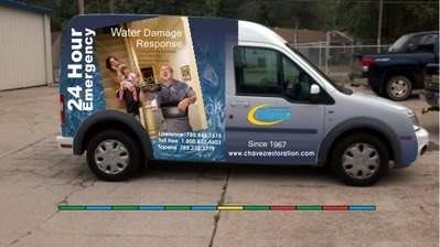
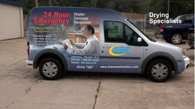
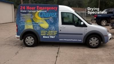
All three of our Transits would have three different images, three water, three fire and three carpet cleaning. These are possible water side wraps, text still needs to be gone over as well as position and color but this is what the image would look like on the water side.

transit_2_zpsc73ce91a.jpg


transit_2-Copy4_zps71d8b42e.jpg


transit_2-Copy3_zps068428bf.jpg
 

XTREME1

RIP
Joined
Nov 13, 2006
Messages
9,681
Location
Ma
Name
Greg Crowley
pictures in this case do not explain what you do so number 1 but take advantage of the door and make FLOOD or water damage bigger
 

BLewis

Supportive Member
Joined
Jun 17, 2008
Messages
1,693
Location
Lexington
Name
Billy Lewis
Richard, I haven't looked at them in depth, however, I love the idea of images to represent the services that you offer. I agree with Greg make the actual text image as large as possible to let the passerby be able to quickly see at a glance what it is depicting.

One question, do you remain in carpet cleaning just to add base numbers to your restoration business, or is it still profitable for you?
 

Desk Jockey

Member
Joined
Oct 9, 2006
Messages
64,833
Location
A planet far far away
Name
Rico Suave
Many reasons but yes we want to make money at it. There are often stretches where we have no restoration work, (we operate in two markets that barely reach 200,000) so we clean more carpet than others restoration companies that operate in larger markets.

Our carpet cleaning customers are the data base that we hope to impress with carpet cleaning so when they have a loss they call us for that too!

The rear will have carpet images, like this.

transit_2-Copy2_zps95b9ada5.jpg
 

prodrying

Member
Joined
Nov 28, 2007
Messages
78
We elected not to do the wrap and just stuck with our normal design. I got bid from 2000 -2500 to wrap the transit and our normal lettering just cost 800. Also, I have been told that the wrap will need to be replaced in about 5 years due to fading.

By the way, we do some water damage jobs out of our transit too. We have it set up to hold 12 air movers, (9 phoenix axials, 3 centrifugals), two phoenix 200 HT's or 270 HTx's, extension cords, meters, tools, trash bags, tape, etc. For a small job it works great. Especially since now days it seems like 80% of all drying jobs we do need no extraction.
View attachment 1480View attachment 1481
 

Royal Man

Member
Joined
Oct 8, 2006
Messages
4,989
Location
Lincoln NE
Name
Dave Yoakum
Wraps may cost more. But they deliver a bigger instant punch if done right. Like they say." A picture is worth a 1000 words. Richard, Your designs kick ass!!!
 

Desk Jockey

Member
Joined
Oct 9, 2006
Messages
64,833
Location
A planet far far away
Name
Rico Suave
That looks great Kevin!

We have used ours to pickup WDR equipment but no actual jobs out of it.

The wraps do fade, one of the Prius's is faded bad but a new Transit is on its way or we would need to re-wrap it. Not happy about the price but for the marketing value, I feel its worth it. ???
 

TomKing

Supportive Member
Joined
Sep 18, 2012
Messages
1,125
Location
Indianapolis
Name
Tom
Richard
I got to say the message of your brand is being lost.

Look at all major national companies all the trucks look a like so that everytime you see it you remember it.

Branding is putting the same message into someones mind over and over.

I would go with a much simpler design. What are the 2 things you want people to get every time they see your vans.

For me I want them to get we clean carpet and our phone number.

You have a older brand than mine and probally a strong image in your community.

My suggestion these should be mini versions of the big trucks so the brand is consistent.

When I did graphic design and freelanced for major accounts they all had brand books that spelled out how the logo was used on any application.

I love your chavez name with the circle swoosh design. I would stay with that and use text to focus on the 2 things I want them to get.

Trucks are billboards and the rule for billboards is 9 words or less. I would try to stay in those tried and true guidlines for advertising.
 
  • Like
Reactions: Hoody and Ken Snow

TomKing

Supportive Member
Joined
Sep 18, 2012
Messages
1,125
Location
Indianapolis
Name
Tom
Man you guys are sure a buzz kill. : (

Seriously Ill have to discuss that with Dan. Here I've spent 6-moths telling how great the wrap will be.
:eekk:

It will be even greater when your branding causes your business to grow and you are making even more $$$$$$$$$$$$$$$$$$$$$$$$
 

Shane Deubell

Supportive Member
Joined
Jun 30, 2011
Messages
4,052
I went down that road Richard using pictures and now feel it was a mistake over the long term. Originally had a blue van with some sharp lettering and think i had it right the first time.
Sometimes we over think things and should just keep it simple and repeat.
 

Royal Man

Member
Joined
Oct 8, 2006
Messages
4,989
Location
Lincoln NE
Name
Dave Yoakum
I went down that road Richard using pictures and now feel it was a mistake over the long term. Originally had a blue van with some sharp lettering and think i had it right the first time.
Sometimes we over think things and should just keep it simple and repeat.
I've been getting the opposite reaction. Shane, do you market your wrap to maximize it? I didn't see it on the front of your website. If done right, a wrap can make more impact than a lettered van and be a USP in itself.
 

Shane Deubell

Supportive Member
Joined
Jun 30, 2011
Messages
4,052
I've been getting the opposite reaction. Shane, do you market your wrap to maximize it? I didn't see it on the front of your website. If done right, a wrap can make more impact than a lettered van and be a USP in itself.

Depends which website...

I agree dave when you are super nichee in residential where we are today but if i want to build residential up over the next 10 years then this is one of the things we have to change.
 

Royal Man

Member
Joined
Oct 8, 2006
Messages
4,989
Location
Lincoln NE
Name
Dave Yoakum
I guess I don't understand. A nicely wrapped van conveys a lot of attention in a residential driveway, Leave a magnet that is your wrapped van. Business cards that are basically just your wrapped van. Five around are a door hanger with your offer and van biz card tear off or magnet and list of happy testimonials. Have it on your fake $20 bills for friends of clients. Just blast it everywhere.
 

Desk Jockey

Member
Joined
Oct 9, 2006
Messages
64,833
Location
A planet far far away
Name
Rico Suave
I just went to take my wife to work and as I passed one of the sports bars there was a Budwiser Transit van wrapped. Looked really cool!

I think I'll take a little from Tom and Ken and make the logo bigger....but keep the wrap. I'll see what we can come up with that will work best with both the logo and the wrap.
 

Royal Man

Member
Joined
Oct 8, 2006
Messages
4,989
Location
Lincoln NE
Name
Dave Yoakum
There is a Miller Transit here. Very large bubbly, cool/ frosty bottles of beer. Not much copy. The same formula for a lot of the vehicles that grab attention.
 

Desk Jockey

Member
Joined
Oct 9, 2006
Messages
64,833
Location
A planet far far away
Name
Rico Suave
I went down that road Richard using pictures and now feel it was a mistake over the long term. Originally had a blue van with some sharp lettering and think i had it right the first time.
Sometimes we over think things and should just keep it simple and repeat.
It is definitely more expensive to do the wraps but I really think it will be an attention grabber??????
 

Shane Deubell

Supportive Member
Joined
Jun 30, 2011
Messages
4,052
I guess I don't understand. A nicely wrapped van conveys a lot of attention in a residential driveway, Leave a magnet that is your wrapped van. Business cards that are basically just your wrapped van. Five around are a door hanger with your offer and van biz card tear off or magnet and list of happy testimonials. Have it on your fake $20 bills for friends of clients. Just blast it everywhere.

Exactly, which is my point!

For a niche service, being parked in the driveway IS the goal but for a contractor that wants to grow a picture is hard to read driving around, let alone remember. A color/simple message would create more awareness.
 

The Great Oz

Member
Joined
Nov 25, 2006
Messages
5,289
Location
seattle
Name
bryan
Man you guys are sure a buzz kill. : (

Seriously Ill have to discuss that with Dan. Here I've spent 6-moths telling how great the wrap will be.

Haven't you guys learned yet? Richard wants approval, not improval!
 

Royal Man

Member
Joined
Oct 8, 2006
Messages
4,989
Location
Lincoln NE
Name
Dave Yoakum
Exactly, which is my point!

For a niche service, being parked in the driveway IS the goal but for a contractor that wants to grow a picture is hard to read driving around, let alone remember. A color/simple message would create more awareness.

Each their own. I think a picture / With simple text, is far easier to read driving around and creates more instant, impact and awareness. Remember the old adage," A picture is worth a thousand words." (Unless you were joking and jerking my chain.)
 
Last edited:

TomKing

Supportive Member
Joined
Sep 18, 2012
Messages
1,125
Location
Indianapolis
Name
Tom
If it's the right picture.
The picture should stand on it's own to deliver the message.

I humbly could not disagree more when we are talking building your brand.
A picture is not enough.

I can not think of one national brand that uses a picture alone to define their brand.

Yesterday, I saw 2 red trucks with the Coca Cola logo only on the sides and back. Those two trucks stuck out in traffic. No picture
I saw 4 UPS trucks turning the corner just brown vans with a small logo. No picture
I saw 2 Enterpirse rental vans. White vans and just a small Logo.
I saw 5 yellow vans with just a logo. Stanley Steemer

Gentelmen Can I humbly ask a question.

Why are all these large companies not changing their fleets to busy wraps with picture backgrounds? Oh and dont forget 50 or more words imprinted all over the van in 1 inch lettering.

Because the human mind can not focus on so many things. Advertising is about imprinting an concept, image ( your logo) or statement in your mind over and over.

If you buy media the number one thing they sell you on is impressions. How many impressions do you get?

We are all small operators on this board even the largest of us in comparison to national brands. We can not aford to let our impressions from people seeing our trucks, our ads, our materials be confusing and inconsistant.

Good or bad pick a simple design and stay with it for a long long time.

I think we would all agree. Stanley and Chem Dry are not the best logos or designs but the long term consistancy they have had has placed them at #1 and #2 in most everyones market. There are only 2 people on this board that I know of the might be beating or rivaling them.
 
  • Like
Reactions: Desk Jockey

Royal Man

Member
Joined
Oct 8, 2006
Messages
4,989
Location
Lincoln NE
Name
Dave Yoakum
Of course you need more than a graphic. The ideal combination is a large graphic or interesting background and just a little copy. It doesn't apply just to van graphics either. Looks at one of your wife's magazines or a upscale man's magazine and you can see this formula repeated over and over again. The nation brands have paid multiple millions to have a recognizable name or logo. We don't have that recognizability. WE need all the help we can get. A graphic can draw in viewers or get a little more attention. So, the prospect can read your copy.(As far as national brands . I have seen several wraps that are just pictures of the product. from soda pop to beer) - If you pick through the many that are too busy you can find a few good examples here: http://www.google.com/search?hl=en&...75,d.dmQ&fp=1d4841c2d4eadd55&biw=1081&bih=478
 
Last edited:

TomKing

Supportive Member
Joined
Sep 18, 2012
Messages
1,125
Location
Indianapolis
Name
Tom
Of course you need more than a graphic. The ideal combination is a large graphic or interesting background and just a little copy. It doesn't apply just to van graphics either. Looks at one of your wife's magazines or a upscale man's magazine and you can see this formula repeated over and over again. The nation brands have paid multiple millions to have a recognizable name or logo. We don't have that recognizability. WE need all the help we can get. A graphic can draw in viewers or get a little more attention. So, the prospect can read your copy.(As far as national brands . I have seen several wraps that are just pictures of the product. from soda pop to beer) - If you pick through the many that are too busy you can find a few good examples here: http://www.google.com/search?hl=en&...75,d.dmQ&fp=1d4841c2d4eadd55&biw=1081&bih=478

Thats why you put a whole paragraph on the side of your van? LOL
 

Latest posts

Back
Top Bottom