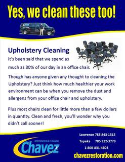
Whuut about something like as a commercial handout?

Desk Jockey

Member
Joined
Oct 9, 2006
Messages
64,833
Location
A planet far far away
Name
Rico Suave
I ran this by Mr. Snow once last year and he shot it down like he was shooting skeet and it was a clay pigeon. :winky:

Erin always wants to drop something and this should make excellent trash can liner material. :eekk:

What do you think. Not you Ken I know what you think of it. :p

CommercialUpholsteryFlyer_zps8a251cf6.jpg
 

Ken Snow

RIP
Joined
Oct 7, 2006
Messages
6,987
Location
Bingham Farms MI
Name
Ken Snow
Ass- other than it being too wordy and redundant- office chairs & upholstery- I think it could be a decent leave behind. I don't know who Erin is but would it be better to leave behind a slightly (not too wordy) more comprehensive commercial cleaning flyer?
 

Desk Jockey

Member
Joined
Oct 9, 2006
Messages
64,833
Location
A planet far far away
Name
Rico Suave
Did Ken pay you to say that Porkchop? Kansans gots smarts real good, we got the reading thing down. :winky:


Ken you already knocked it once, are trying to hit it twice? :p

Erin is our marketer and she has already left behind our commercial brochure several months back. She is currently in the process of dropping off the Newsletters that lack real news and will want something else next month. Then maybe the following month there will be a bit of news in the spring newsletter. ; )
 

jcooper

Member
Joined
Oct 7, 2006
Messages
3,232
Location
IL
Name
Jerry Cooper
Richard,

What about adding more to it, other than just office chairs... Wall partitions, waiting room couches, Tile in break rooms and so on. Then you could have more photos, less text.

Chavez cleans everything Commercial!
 

ruff

Member
Joined
Apr 19, 2007
Messages
11,010
Location
San Francisco, CA
Name
Ofer Kolton
Wtf?


I think you've smelled too many green products today. Oh speaking of green I need to load my bottles and take them to the road.

It was just an innocent question.

Yes, I may have smelled too many, but I never breathed in.

And don't do anything with them bottles before checking first in the "Green Bottle" room.
Please :winky:
 
Last edited:
  • Like
Reactions: Desk Jockey

The Great Oz

Member
Joined
Nov 25, 2006
Messages
5,274
Location
seattle
Name
bryan
Richard,
I read the flyer and was going to cry for you, but I've already cried for you living in Kansas so I'm done.

First sentence: who cares? Second section: who cares? Third section had promise until I tried to straighten it out and realized you're just messing with us.


I'll take a chance that you really wanted suggestions.

Header section:
Commercial cleaning
Commercial savings <appeal to the business or office manager. Skip the picture of the van and reduce the top to bottom height of the swoopy.

Text body:
Something like
We can restore the good looks and protect your investment in commercial furnishings. <appeal to the person that doesn't want to spend money on new

Bullet points of your cleaning offerings:
- Carpet cleaning: resorative and for appearance
- Upholstered furniture, wall panel and cubicle cleaning
- Whatever else you do

Let us show you how we can offer high-quality cleaning at competitive prices by calling us today. <appeal to both manager and owner
Picture in text body could be two techs, one cleaning chairs and one cleaning carpet in a conference/board room. Another could be cleaning chairs and panels in cubicle land.


Footer section: One side blank, either cut to accept a business card or glue the card there. The other side would have a half-the-present-size Chavez logo with your other services listed below it.

Feel free to use your own words :razz:
 
  • Like
Reactions: Desk Jockey

Desk Jockey

Member
Joined
Oct 9, 2006
Messages
64,833
Location
A planet far far away
Name
Rico Suave
Cried? No need to cry, we are Kansas and proud of it. Cry for those fookers in Nebraska or Misery. :winky:

Thanks for the suggestions! No it wazzunt a joke but you did improve it. Pictures are a lot harder, time wise and arranging permission for the photo shoot. But I'll take a look at the schedule. Do think it will have more value than the current graphic?

Thanks again!
 
Last edited by a moderator:

The Great Oz

Member
Joined
Nov 25, 2006
Messages
5,274
Location
seattle
Name
bryan
You know I'm half teasing right?

I don't know that your pile of chairs is the wrong graphic for your target audience. You could add a caption "Cheaper by the dozen."
If you self-publish or have these printed in small quantities you could make several versions and see if any pull better than others.
 

Desk Jockey

Member
Joined
Oct 9, 2006
Messages
64,833
Location
A planet far far away
Name
Rico Suave
Probably 200qty I doubt she hits that many stops in a month, but just in case. With such low qty its an inhouse project, truly just something to give her to have in her hand.

When you get a chance look at my business card too!

Thanks!
 

Desk Jockey

Member
Joined
Oct 9, 2006
Messages
64,833
Location
A planet far far away
Name
Rico Suave
This is another version I couldn't get uploaded yesterday. We've had some network problems and can't get it figured out.

Anyway this is before Bryan's recommendations.

CommercialUpholsteryFlyer3_zpsd4d6fc71.jpg
 

Shane Deubell

Supportive Member
Joined
Jun 30, 2011
Messages
4,052
We have never had too much success selling upholstery cleaning as a stand alone. What we have done is drop it in every proposal even if they do not ask for it and the day before when we call/email to confirm the job always mention they can leave out any chairs and the price is XX per chair.

Off top of my head would say it probably averages out to around 5 per job, maybe a couple more.
 
  • Like
Reactions: Jeff Madsen

Desk Jockey

Member
Joined
Oct 9, 2006
Messages
64,833
Location
A planet far far away
Name
Rico Suave
I think that was Ken's point when I showed it to him last year.

We do a fair share of it but most of it is just called in, they ask us for an estimate. We cleaned a cube set last month for $800.00, complete fabric, metal and vinyl.

Since our marketing person is going to make a visit anyway, why not make them all aware we do it?
Maybe it will bring nothing but in reality we want to continue branding that we are the ones to call when it come to cleaning & Restoration.

Here is Bryan's version, is it better?

CommercialUpholsteryFlyerBryansversion_zpsb66a5d63.jpg
 

Steve Toburen

Supportive Member
Joined
Oct 23, 2006
Messages
1,912
Location
Durango, Colorado/Santiago, Dominican Republic
Name
Steve Toburen
I've already used up my editing time on Mieky's email, Richard. But the guys above are right- "less is more". The problem is we tend to write the way we speak. But as Mr. Sutley so eloquently stated, "Nobody wants to read any more."

Steve

PS Here is an exercise for you. Write out your copy and then cut 50%!
 

Desk Jockey

Member
Joined
Oct 9, 2006
Messages
64,833
Location
A planet far far away
Name
Rico Suave
I have not finished my residential carpet brochure. I'm held up on a shot I want at of tech's entering the door. I think I need Dan to hack off some of his text.

What has this world come to? Everyone just wants pictures, Porkchop wasted his time on his edumakation.

He'll never get back those 9-years at Auburn. :winky:
 

Connor

Member
Joined
May 27, 2011
Messages
3,492
Name
Connor
Dick, I think the prior one's design is better. I don't like the mention of "competitive prices". FWIW.

A local car wash advertizes "A clean car rides better". I think a clean office works better. Perhaps wrangle that into you verbiage. So clean you'll talk about it, er sumthing.
 

Desk Jockey

Member
Joined
Oct 9, 2006
Messages
64,833
Location
A planet far far away
Name
Rico Suave
That sounds more like a tag line than text.

Go give me your serious critic of my business card. No water or wet paper look.....that's so passe. Or as Dave would say "so 80's"

I loved the 80's, KU won a national Championship and the Bears won a Super Bowl!
 

Connor

Member
Joined
May 27, 2011
Messages
3,492
Name
Connor
Considering Dave is Mr. 1979, being call '80s would be a compliment coming from him.

Where's yer business card?

I still think "Call Ese on the carpet!" is a good one. Goes straight (no offense ken snow) to the heart (no offense Mikey) of your Mexican roots ( no offense Kunta Kinte.).
 

Connor

Member
Joined
May 27, 2011
Messages
3,492
Name
Connor
I'm not racist, Richard, I'm just like to show a little meanness with some bad taste.

Oh, yeah, I saw that thread.

Well, I looked at it and I gotta say, I'd call servpro.

I don't like that circle shadow thing around the name. It's been done and done and done. I liked the old logo better. I know it's already done, but I just wanted to say it. The old one wasn't great, but it was better. IMO.

The colors, they make me think of..... turquoise and curry. I don't like the blue. I like the old yellow on black with white. The new blue and yellow seem... I dunno, I don't have a word for it.

Soda blasting...? Saying soda blasting to the public is kinda like when plumbers say "TV Video inspection". We know it's pipe inspection, but homeowners think, "why the heck is a plumber looking at my TV?"


I'd do the logo on the card in the upper left. Associates name in the center. Contact information at bottom. Lose the wave at the bottom of the card. You can say Since 1967, but lose the "Serving NE Kansas".


Two Locations to serve me better? Yeah, if your customers have houses in both Topeka and Lawrence. That back of the card can be scratched. Replace what you have on the back side of the card some benefit.

You really should let a graphic designer do this. Ya'd think with TWO locations ya'd be able to afford a professional.
 

Desk Jockey

Member
Joined
Oct 9, 2006
Messages
64,833
Location
A planet far far away
Name
Rico Suave
I don't like that circle shadow thing around the name. It's been done and done and done. I liked the old logo better. I know it's already done, but I just wanted to say it. The old one wasn't great, but it was better. IMO.
My late uncle did that one, he was a graphic artist but he did it in the late 70's. It needed up dated, it was hard to use because it extended out so long. It would cause the Chavez name to be seen much smaller because the extension of the "Z".

I don't totally love the new one but it was a compromise with my father. We put it on a Prius and a van and showed him how much easier it was to see "Chavez" at a distance. He finally agreed to the change.

Thanks for your edits!

You really should let a graphic designer do this. Ya'd think with TWO locations ya'd be able to afford a professional.
Wait you want a pro graphic designer but you want me to listen to a plumber for marketing direction? :eekk: :winky:
Fookkk! (I put 3-K's in there for you!)
 
  • Like
Reactions: Connor

Latest posts

Back
Top Bottom