New Bidness cards

Desk Jockey

Member
Joined
Oct 9, 2006
Messages
64,833
Location
A planet far far away
Name
Rico Suave
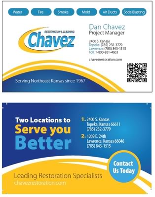
Dan wanted some new business cards, what do you think?

What would you add or delete?

Yoakum? Connor? Shane? Anyone?
Newbusinesscardsfrontandback_zpsd0e330f7.jpg
 

Royal Man

Member
Joined
Oct 8, 2006
Messages
4,989
Location
Lincoln NE
Name
Dave Yoakum
Looks good to me. Although the web site might be hard to read (White on yellow) and maybe increase the font size a little for the address/ phone numbers
 
  • Like
Reactions: Desk Jockey

Connor

Member
Joined
May 27, 2011
Messages
3,492
Name
Connor
Okay, first you need to soak 'em in water so they look water damaged. then on the first side, you need a picture of a dalmatian getting his spots vacuumed off, and a hose border. On the other side, you need a soot like substance that wipes off and reveals a magnified picture of a dust mite.

Put the words

"Se habla Espan-hole"

and


"Call Ese On Teh Carpets!"
 

Ken Snow

RIP
Joined
Oct 7, 2006
Messages
6,987
Location
Bingham Farms MI
Name
Ken Snow
Stop letting Dan do the design work. It needs lots of little tweaks to make it go from marginal to very good.

Sent from my DROID RAZR using Tapatalk 2
 

Desk Jockey

Member
Joined
Oct 9, 2006
Messages
64,833
Location
A planet far far away
Name
Rico Suave
Okay, first you need to soak 'em in water so they look water damaged. then on the first side, you need a picture of a dalmatian getting his spots vacuumed off, and a hose border. On the other side, you need a soot like substance that wipes off and reveals a magnified picture of a dust mite.

Put the words

"Se habla Espan-hole"

and


"Call Ese On Teh Carpets!"
Chris, You're not helping either!!!
 

Desk Jockey

Member
Joined
Oct 9, 2006
Messages
64,833
Location
A planet far far away
Name
Rico Suave
Pretty much what ever I want.

"It's good to be the King" ; )

I am the rain maker, I am the marketing director, I do weekly payroll, I design training programs, I purchase equipment and supplies. What I'm great at is nit picking what everyone is doing. I'm excellent at putting my 2¢ in where its not needed or asked for. LOL

Because ya know I could do it better if they let me. :winky:
 
  • Like
Reactions: GCCLee

Dan

Supportive Member
Joined
Dec 19, 2006
Messages
979
Location
Beaumont, Ca
Name
Dan
Pretty much what ever I want.

"It's good to be the King" ; )

I am the rain maker, I am the marketing director, I do weekly payroll, I design training programs, I purchase equipment and supplies. What I'm great at is nit picking what everyone is doing. I'm excellent at putting my 2¢ in where its not needed or asked for. LOL

Because ya know I could do it better if they let me. :winky:


LOL... Finally, a honest answer on the boards.
 

Shane Deubell

Supportive Member
Joined
Jun 30, 2011
Messages
4,052
LOL, my business card sucks, time to talk to phillip for a redo.

I like the background theme but would do the total opposite, shrink logo and put in the corner and make name,phone #, website stand out more.
 
  • Like
Reactions: GCCLee

Connor

Member
Joined
May 27, 2011
Messages
3,492
Name
Connor
Okay, so, just give out cards that are wrinkled from being wet or some other like textured stock to make it look wet. If the printer can't make it happen, just put a lot of cards in your pocket on Friday when you're at Dan's house engaged in sweating out your national pastime, cutting grass.
 

Shane Deubell

Supportive Member
Joined
Jun 30, 2011
Messages
4,052
Glad you brought this topic up, mine are being redesigned this week. We needed more color, updated look.

One question for you guys?

We have always used back for appt information, do you like that idea?

lp.aspx
 
Last edited:

Royal Man

Member
Joined
Oct 8, 2006
Messages
4,989
Location
Lincoln NE
Name
Dave Yoakum
I'm trying to promote my USP. So, My biz card just says: "Lincolns most recommended Cleaner" And a large pic of my van filling the rest of the card.( Sometimes less is more.)
 

Royal Man

Member
Joined
Oct 8, 2006
Messages
4,989
Location
Lincoln NE
Name
Dave Yoakum
I agree Dave, sometimes less is more.

But, of course "More" is ALWAYS....More!

You know better than that. Take your Transit for instance. Going down the street, I would only get one (Maybe two) large words and the graphic. Too much copy can be over whelming and the viewer becomes blind to it. Then more becomes less. We are so, overloaded with marketing messages everyday that sometimes it's better to tell your message in a brief flash. Because, you won't get a second chance or the 30 seconds or more to read all the copy. If you look at modern advertising a lot is just a big graphic and a few words.
 

Desk Jockey

Member
Joined
Oct 9, 2006
Messages
64,833
Location
A planet far far away
Name
Rico Suave
You are right, all I hope they see is the logo and the graphic. On the Home Show display and banner pull ups I'm trying to finish up are the same. Grab them with the graphic and hope they remember the logo.
 

Latest posts

Back
Top Bottom