So, I'm finally going to make a move and get the van lettered(I think most now print it out like a wrap). Just looking for some advice. This is not going to be a full wrap or anything nuts, Simple logo and some lettering.
My question, what would you consider to be must have info on the van?
Other than: logo, phone, website, what we do(carpet, upholstery,tie & wood).
That seems to be about it, as far as I can tell.
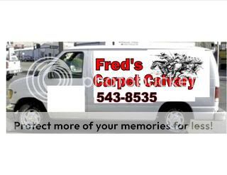
View attachment 1216
Any thoughts on the first try by my "guy"? I doubt I'd go with the little guy on there, but he did a really nice job. I'm sure this one is more then we want to spend.
My question, what would you consider to be must have info on the van?
Other than: logo, phone, website, what we do(carpet, upholstery,tie & wood).
That seems to be about it, as far as I can tell.
View attachment 1216
Any thoughts on the first try by my "guy"? I doubt I'd go with the little guy on there, but he did a really nice job. I'm sure this one is more then we want to spend.